Friday, 29 November 2013

Research: Case Study

Teen Now is a pop music magazine which is aimed at teenage girls, 13- 19, who are interested in fashion, shopping and pop music.

Front Cover
 
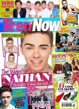
 In this cover of Teen Now magazine there is a variety of colours used to make the cover look more appealing to their readers. There are roughly five different colours used in this cover, the use of different bold colours make the magazine look more exciting and shows the pop side of the magazine since pop music is fun and exciting. The pink colour is a girly colour which connotes that the magazine is aimed at teenage girls, the bright colours such as blue and yellow makes the cover stand out to the reader and makes it look more appealing. The pink is used to emphasise the main cover line which is about One Direction to capture the readers attention straight away, the font for the main cover line is also bigger which helps to capture attention.

Teen Now magazine has many images of pop stars that would attract the target audience. The main image is of One Direction. This image appeals to the target audience because many teenage girls like One Direction. The title 'Teen Now' appeals to teenage girls. The word 'Teen' is used to show that the magazine is for teenage girls and the use of the word 'Now' shows that the magazine is up to date with the latest pop music and gossip. The subtitles for the magazine are about fashion, other bands such as District 3or Little Mix and other teen celebrities who are male this appeals to the target audience because they may be interested in the latest fashion as well as music and they may like the other bands that are in this issue.

The language in the magazine is colloquial this shows that the magazine can relate to the target audience, the magazine uses phrases such as "Hot Boys Galore" and words such as "hunks" and "chilled" this shows that the magazine is relatable to their target audeince by writing colloquialy, these words are what the reader woul use and therefore sounds peronal and friendly. It makes the magazine sound like a friend talking to the reader. The magazine doesn't relay on the emotive or colloquial language, it relays on their images.
 
The price of the magazine is £2.50 this reflectes the target audience, the magazine is not expensive because it's aimed at teenagers who are still in school or college so they don't have money to spend on expensive magazines. The price makes it affordable for teenagers.
 
Contents Page
 
The conventions that the contents page follows is that it has the logo of the magazine, images which relate to the front cover and the page numbers are written in bold. The content's page has been made to attract the audience. There are images of band members, clothes and other male teen celebrities this  appeals to the target audeince. The colours in the contents page is similar to the colours on the front cover.
 
Double Page Spread
 

 The topic of the article is One Direction on their new movie 'This Is Us'. The theme of this article is real life experiences they talk about the film and shows an insight of their life so that the fans could get to know them better. The target audience may find this article interesting because they may be a fan of One Direction and this article gives informs them about their movie, this may interest the reader and make them excited to watch the movie. The double page spread is the main coverline which persuades the target audience to buy the magazine so this article may be the reason why the target audience purchased the magazine.

Editor's Letter

A letter from the editor is used to welcome the reader and build an informal relationship so that the reader feels familiar. The editor will often add a photo and a signature to make it feel like a real person. In this editor's letter it has many conventions such as a short introduction to the magazine, it uses informal language such as "fav" and "hot boys" to make it seem as if the reader is talking as a friend. The letter welcomes the reader "welcome to the brand new issue of your favourite magazine!". There's a photo of the editor and a signature to make it feel like it is a real person. This editor letter talks about the issues in the magazine, it build a relationship with the reader.


Monday, 11 November 2013

Research: Media Audiences

The audience is any group of people who receive a media text. All audiences are different and in media studies we are particularly interested in the target audience. This is the audience that media producers aim their product at.


Magazine Title
Target Audience
Leisure Time Interests
Look
13- 25, females
Fashion, shopping
Teen Now
12- 19, teenage girls
Fashion, shopping, pop music
Keerang
13- 25, females and males
Rock music

Research: Parent Companies and Cross Media Ownership

A Parent Company is a firm that owns or controls other firms (called subsidiaries). Some parent companies also own more than one product within the same media.

It is beneficial for a parent company to own more than one product within the same media, for example Bauer own Kerrang and Mojo both music magazines, this helps the company earn money instead of earning money from one magazine they get money from both magazines.

Cross Media Ownership is when the parent company promote their subsidiaries through each other. As well as Kerrang and Mojo, Bauer own Kiss. On the Kiss Website Kerrang magazine is advertised on the website as a form of Cross Media Ownership this promotes the products to a wider audience. This is an example of how Bauer uses their subsidiaries to promote each other.

The audience is not made aware of the parent company ownership. The ownership doesn't affect the consumer and Bauer, as long as the consumer receives their product then they will be happy but some consumers may feel that Bauer are a bit sneaky since they're making a profit from owning many products.

Thursday, 7 November 2013

Shooting Schedule


Shot
Content /Action
Shot type
Costume/ hair/ make up
Props
Personnel
Equipment
1
Artist looking at camera with sultry expression or a smile
Close up shot or head and shoulder shot
Artist costume: leather jacket, simple top. Hair: loose and wavy. Make up: smoky eye shadow, pink or red lipstick, blusher
 
Artist, stylist, photographer, makeup artist, location manager
Simple back drop, digital camera, batteries, memory card
2


Artist sitting down on grass or chair with an instrument
 
Mid shot
Artist costume: leather jacket, simple top, jeans, perhaps converses or boots. Hair: loose, wavy, pushed to one side. Make up: natural or kept the same.
Guitar
Artist, stylist, photographer, makeup artist, location manager
Digital camera, batteries, memory card, background of garden, guitar
3
Artist leaning against building or lamppost, hands tucked in pocket, looking away from camera.
 
Mid shot or mid- long shot
Artist costume: leather jacket, simple top, jeans, perhaps converses or boots. Hair: loose, wavy, pushed to one side. Make up: smoky eye shadow
bag
Artist, stylist, photographer, makeup artist, location manager
digital camera, batteries, memory car, a bag
4
Side shot of artist looking away or looking down


Mid- close up shot
Artist costume: leather jacket, simple top, jeans, perhaps converses or boots. Hair: loose, wavy, Make up: smoky eye shadow
 
Artist, stylist, photographer, makeup artist, location manager
digital camera, batteries, memory card
5
Playful image of artist posing in a garden(?) looking away from camera


Mid- long shot
Leather jacket, simple top, jeans, perhaps converses or boots. wavy hair, smoky eye shadow
Bag (?)
Artist, stylist, photographer, makeup artist, location manager
digital camera, batteries, memory card

Research: Magazine article (double page feature)


Thursday, 3 October 2013

Research: Editor's letter

A letter from the editor is used as a short introduction to the magazine, the letter welcomes the reader. It builds an informal relationship so that the reader feels familiar, they may mention a previous issue to make the magazine seem familiar to the reader, it seems as if they're 'coming back' to the magazine. The editor will often add a photo and a signature to make it feel like a real person.


Teen Now Magazine

The magazine's editor has written the letter to make it sound friendly "we also have some gorgeous pics of Ross Lynch, Austin Mahone and some of the hot boys from Waterloo Road!" The editor is writing in an informal style to connect with the readers and seem like a friend, this makes the magazine seem more personal to the target audience, who are teen girls from ages 13-19. The use of celebrity names in the editor's letter makes the reader more excited to read the magazine and assume that the editor can actually relate to them.


Look Magazine

The magazine's editor has written the letter to make it informative. "...we've selected an edit of the must-do trends, straight from the runaway, landing on the high street (from p18)" this informs the reader of where to find the edits of the must- do trends. "Let me know what you think of the issue-" the editor makes her seem like a friend as she's welcoming the readers opinions through her twitter and addresses the reader as "you" which makes it seem as she has a personal relationship with the reader. The tone of the magazine reflects on the target audience which is females from ages 15- 25, the editor's note is not as informal as the Teen Now magazine's editor's letter.

Tuesday, 1 October 2013

Research: Emotive and Colloquial language

Teen Now

Teen Now is a magazine target at teenage girls from ages 13- 19, who have an interest in fashion and pop music.

In this magazine the colloquial phrases is not really used to attract the target audience, the magazine relays more on their images and their bright colours. However, colloquial phrases such as; "cool", "get punky" and "Hot boy galore" are used to relate to the target audience and make it seem like the magazine is made just for them. Emotive words and phrases are also used to attract the target audience such as; "Win! The new 1D perfume" makes the readers excited because they can win a perfume from their favourite band. Also reading the words "I thought it was the end..." may make the readers curious and and sad.

The words "cool" "get punky" and "hot boy galore" makes the magazine sound like it's another teenager  talking to them, so it sort of makes the magazine sound like a friend. Some of these words such as "hot boys" and "cool" are words that the readers would use and therefore it sounds personal and friendly.The phrases such as "Win! The new 1D perfume" and "I thought it was the end..." creates an emotional reaction from the reader.

Magazines usually use colloquial and emotive language usually through their cover lines to attract their target audience. Colloquial words such as "cool", "get punky", "hot boy galore" is used in the cover lines besides the images these colloquial words show that the magazine can connect to the readers and relate to their use of everyday language to make the magazine easier to read. Emotive words such as "Win! The new 1D perfume", "I thought it was the end..." and "in the studio with District 3" makes the readers curious and excited these emotions persuade the reader to buy the magazine. However pop magazines such as Teen Now rely on the images to attract the readers but their use of colloquial and emotive language helps to attract the reader as well.


Monday, 30 September 2013

Research: Ideology and Values

Look Magazine

This magazine mainly focuses on fashion, gossip and celebrity lifestyles. Many articles in the magazine is based around the theme and topic of fashion and makeup such as the articles "The Front Row's Best Outfits On The High Street Now!", "The New Beauty Miracles To Try Now" and "Fashion's NEW 'It' Girl." There are also articles on gossip and celebrity lifestyles such as "Ellie Goulding- Why Cara & Rita Tell Her Everything, Her Secret Holiday With 1D's Niall".

Get your copy of LOOK now


Looks magazine gives the reader a message on fashion and celebrity lifestyles. The magazine gives the reader a message that they should wear the latest fashions to look and feel good.

The three main topic areas the magazine covers in the latest fashion and the latest gossip in a certain celebrity's life.

The magazine's ideology (the lifestyle that the magazine is promoting) is showing the reader that fashion plays a big part on society and looking good, keeping touch with the latest fashion is a big deal because it makes you look and feel good, it makes people notice you. Also, that knowing about the latest gossip and a celebrity's lifestyle will help with social interaction because people in today's society like to gossip and know about the latest gossip.

The target reader may find the articles interesting because it keeps them informed of the latest fashion and what kind of clothing their favourite celebrity is wearing at the moment, it also keeps them informed of the latest gossip spreading around their social group and the media. For e.g. this issue of the magazine dicusses the gossip based around Ellie Goulding and Niall Horan, it also shows the reader the latest fashion and beauty tips.

Tuesday, 24 September 2013

Research: Contents Page


Research: Conventional layout of a magazine


TOP OF THE POPS MAGAZINE


Masthead: ‘TOPOFTHEPOPS’ Big bold writing to make the title of the magazine stand out. It’s written in pink to appeal to a young female audience. 

Cover lines: show what else is featured in the magazine, the font is smaller than the main cover line. It’s used to appeal to a wider audience For e.g. One Direction is used as a cover line to attract more readers whose interests is one direction. The cover line about fashion is used to attract a secondary audience who have an interest in fashion as well as music. This helps the magazine gain a wider audience.   

  Image: Famous pop icon- Cher Lloyd. It is positioned in the middle since Cher Lloyd is the main story of the magazine. Cher Lloyd appeals to the magazines target audience 13- 19 year old females. The bright blue colour of her outfit also shows off the bright, fun attitude of pop music. The magazine relays on the image to attract the target audience.


Main Cover line: is positioned on top of the main image, it’s connected to the image. The main cover line reads ‘The Real Cher Lloyd’ which is connected to the Cher Lloyd image. It’s written in bold writing and is placed in a pink bubble to make it stand out.


Colour: the colour theme for the magazine is pink to make it look girly and attract a young female audience. Pop music is mainly about romance, the pink can connote romance. It also shows the attitude of pop music- it’s loud, the pink stand out, fun- the bright colours in the magazine gives you the pop music attitude.

Price/ Barcode: The price for this magazine is around £2.75- £3.99 so that the young readers can afford it since it is aimed at an audience that are in school. It is a monthly magazine so the reader doesn’t have to spend too much every week. 
  
Convergence: The free poster of one direction is used to attract a wider audience who like One Direction as they are a popular icon for teenage girls. Also by the barcode there would be the website name so fans can be kept updated and the magazine gets a wider readership.

  
VIBE MAGAZINE

Mast head: the word ‘VIBE’ is written in big, bold and colourful writing. R ‘n’ B is represented as loud and aggressive and the title written in uppercase and an orange colour connotes this. 


Target Audience: The target audience of this magazine is 14- 19 who have an interest in R ‘n’ B and Hip- Hop; it’s targeted to both genders but mainly females. 


Cover line: shows other features in the magazine and are written in a smaller font than the main cover line. The cover line for this magazine includes article of other R ‘n’ B artists such as ‘Drake’ who’s very popular in this genre.


Image: Nicki Minaj is the only image on the magazine and she’s placed in the middle of the magazine to show that this issue is about her. The orange in her hair matches the colour theme of the magazine. Nicki Minaj appeals to many people who listen to R ‘n’ B and Hip- Hop.
 
Barcode/ price: The price of the magazine is around £3.00 and is published monthly so the young readers can afford to purchase the magazine. 


Convergence: Has the name of the website written under the bar code so the readers can view the website and keep updated by the website. It benefits the magazine as well since it offers a wide readership meaning they make a profit. 


The language of the magazine is informal to appeal to young readers. Informal language is used to connect to the readers.  Includes fashion to appeal to a wider audience who are interested in music and in fashion, the fashion feature in this magazine is aimed at the male audience who might want to dress as their favourite icon within this genre.


Tuesday, 17 September 2013

Research: Convergence


Convergence

Convergence is the occurrence of two or more things coming together. Different type of media forms would usually be placed on a magazine for example social networking sites, websites, audio giveaways (e.g Cd's) and competitions to be entered online and posters inside the magazine and freebies.

Social networking sites and websites promotes the magazine and keeps the fans updated it also helps the fans interact with each other. Convergence of media platforms such as this creates a far wider readership creating more profit for the magazine. 


Seventeen magazine used convergence. Their target audience is teen girls from ages 14- 20. In their magazine they give away freebies which would come in use for a teenage girl for e.g in this issue of the magazine, on the top of the cover it states that on page 20 you could get free lip gloss. At the top it also has a competition is which you can win money. Also it has the website name seventeen.com on the left side, bottom corner so that the readers can check for updates, it offers wide readership creating profit for the magazine. Ad's also sponsor the magazine on the website giving them more money. Magazine convergence is effective for both the reader and the magazine.

Monday, 16 September 2013

Research: Magazine House Style


Magazine House Style

A magazine housestyle is when a magazine uses a similar layout. For e.g where the masthead is placed, similar colours, logo etc. It's effective because it helps the reader identify the magazinethey're looking for since they would have an idea of how the magazine front cover would look like. House style is used by nearly every magazine to give it a specific individual look.


Kerrang magazine always has the same font and similar colour used for the mast head so the reader knows how the magazine title looks like, so they can identify it when looking for it in shops. Kerrang has a big picture which is either on top of the masthead or below it, it is usually of a popular rock icon since Kerrang focuses on rock music.

Saturday, 14 September 2013

Lifestyle Magazine Research

Lifestyle Magazine Research


Magazine: Vogue (Fashion) Entertainment Weekly (Movies/ TV) OK! (Gossip)
Image where is it positioned? How much of the page does it take up? Emma Stone- appeals to a wide audience. The only image. Takes up whole page. Positioned in the middle- Bust shot. Emma Watson as Hermoine from Harry Potter. Takes up the page, positioned in the middle- mid shot. On top of the title. Many images to show what's inside. Main article is bigger (e.g the main article is of Kate Middleton- bigger image takes up more space)
Cover lines where is it positioned? How much of the page does it take up? On the side. On top of the image. Takes up the page below the Title. Written in simple font about fashion. Shows other features in the magazine. Placed on the sides, on top of the image. Simple font. On the sides, in bold font but smaller size than the title.
Main Cover lines where is it positioned? How much of the page does it take up? 'Autumn Fashion' written in big, bold, pink writing- 'girl-y' connotes feminism. Positioned towards the bottom of the page. 'Harry Potter'- in a bigger font than other cover lines because it's the main focus. Based on Kate Middleton so it's in a bigger size, bold font, right besides the image.
Title where is it positioned? How much of the page does it take up? 'VOGUE' positioned on top of the page. Big, Pink writing- goes with the light colours on the cover. Pink connotes feminism. Takes us the top. 'Entertainment' written in big, bold writing and 'Weekly' placed below it in a smaller font and size. Positioned on the top of the page, takes up the top. Below the image. 'OK!' positioned on the side, big, white font. In a red box. The box makes the title stand out the red could connote trouble, romance and danger.
Tagline where is it positioned? How much of the page does it take up? No Tagline. No Tagline. No Tagline.
Price where is it positioned? How much of the page does it take up? Small writing placed to the left, besides the title. £4.10 affordable for a monthly magazine. Not clearly shown through image. Right below the title in a smaller, simple font. £1.99 for a weekly magazine- affordable price for young adults/ teens.
Date where is it positioned? How much of the page does it take up? Positioned on top of the price in the same simple font and size. Above the title in simple, small font. Positioned besides the price, under the title. In a small simple font.